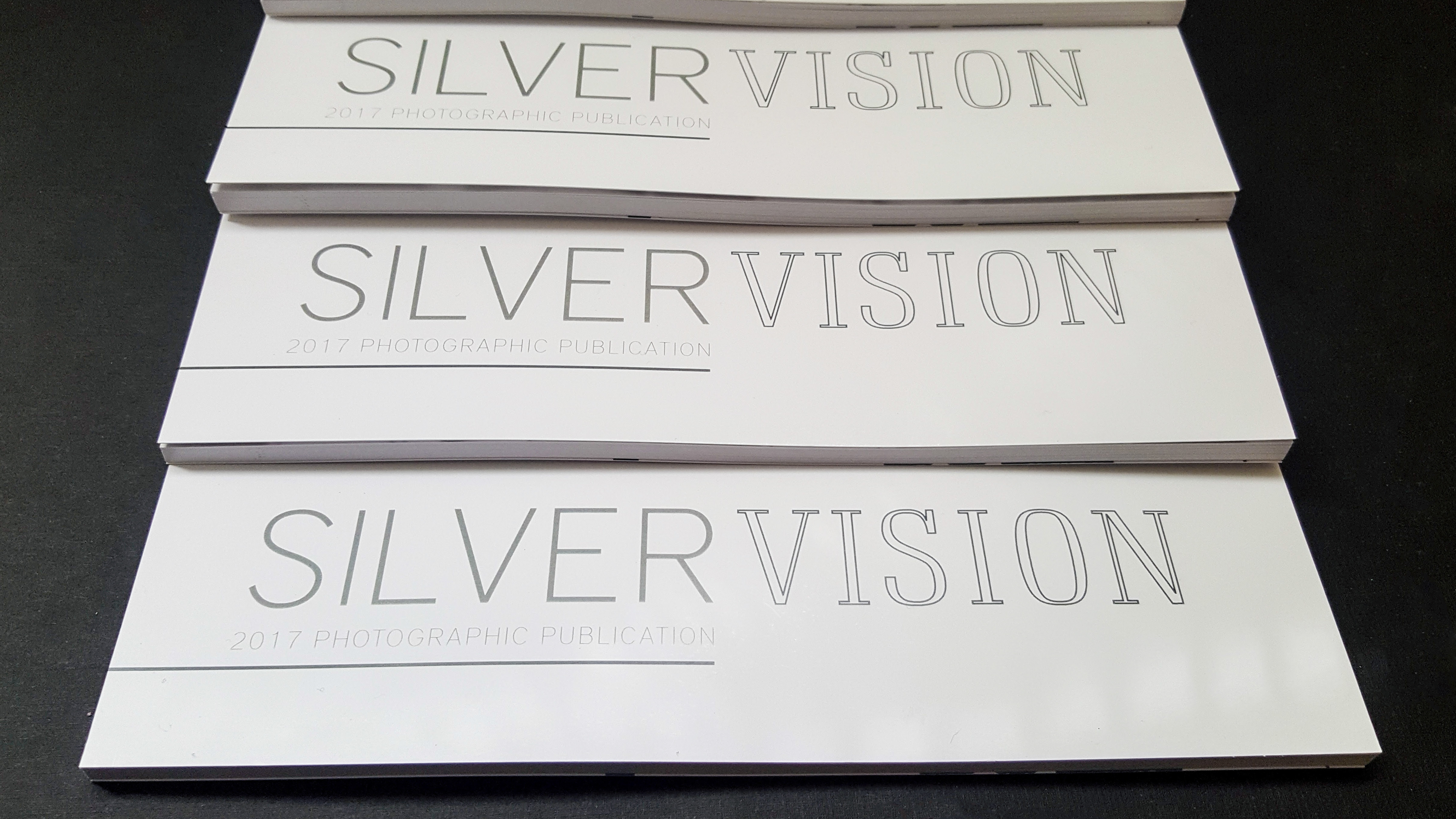
Produced at Edinboro University.
George Eastman: America's Storyteller is a graphic design publication highlighting the life and times of George Eastman and the massive photographic company he had created during his lifetime. With the conceptual use of transparent paper stock being hand-stitched into the spine, this publication creates for an interesting read.
Without photography, the world would be nothing. George Eastman and the Kodak camera altered history in more ways than one can imagine. So, I wanted to explore the major photographic company that started the photography craze in depth. From the founder, to the brand, to Eastman’s philanthropy, this chapbook encompasses the life and times of George Eastman and the Kodak company.
For the basic layout, I chose to format the book in the aspect ratio of a 35mm film strip since Kodak started out as a film-based company selling dry plates and film supplies to the general public. Beyond the idea of the filmstrip, hand-stitched pages of transparent paper were inserted to reference film negatives. The color scheme was an obvious choice with the signature red and yellow of the Kodak brand. Typeface Avenir was selected for the body copy to create continuity with the Kodak website and build upon the similarity to the Kodak brand. Typeface Baskerville was selected as the display text because much like Eastman, John Baskerville designed his self-named typeface from a series of experiments, perpetually wanting to amend his latest refinements and developments from the previous. With the velvet-like surface and smooth surface, Neenah Classic Crest paper stock was the chosen stock, to mimic the look and feel of a silver-gelatin print. The cover is similarly printed on a smooth Mohawk cover stock, with a subtle warm hue, for the aged tonality of photographic prints.


